01
The offer is hard to read.
People should understand what the business stands for before the visual system asks for attention.
Clarify the position first, then build a visual system that gives the business a consistent way to show up across its website, campaigns, and day-to-day creative.
Brand identity becomes valuable when the business has outgrown scattered visuals, unclear positioning, or creative that changes from one channel to the next.
People should understand what the business stands for before the visual system asks for attention.
Website, social, campaigns, and sales materials need one recognizable visual logic.
The identity should be able to support where the company is going, not only where it started.
Practical rules make future creative faster to produce and easier to keep coherent.
The identity system is built from decisions the business can actually use, not a pile of disconnected visual options.
Define what the brand needs to communicate, who it needs to matter to, and the role the identity has to play.
Translate the approved position into a focused visual direction across logo use, typography, color, imagery, and hierarchy.
Turn the direction into repeatable rules and working applications instead of one-off design treatments.
Document the core decisions so future website, campaign, and social work can stay consistent.
The approved MUNO wordmark was shaped around three ideas from the brand system: a subtle dog cue, rounded simplicity, and clean geometry. The construction grid then formalized spacing, stroke consistency, and clear space.
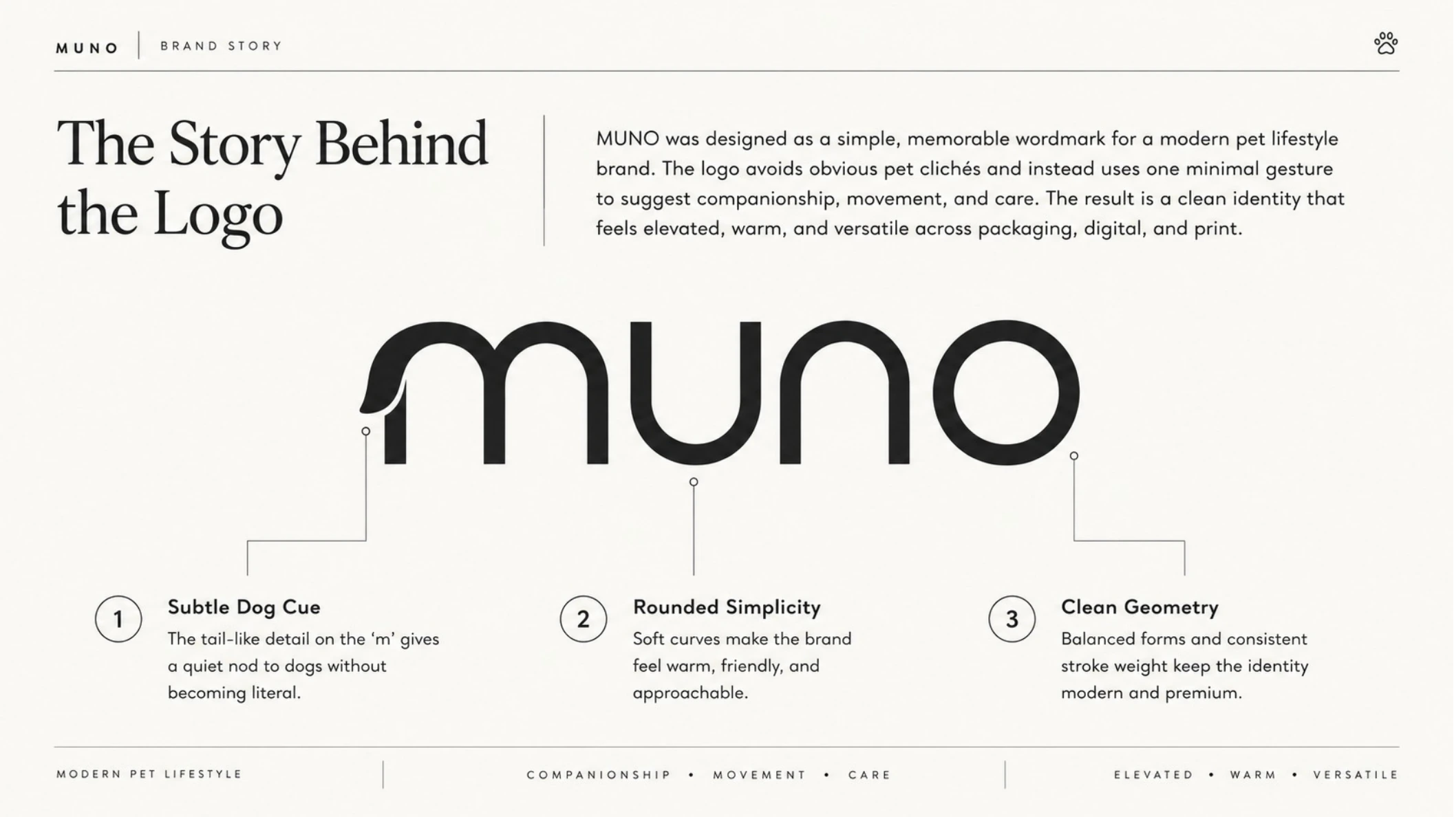
The tail-like detail on the “m” gives the identity its pet cue, while soft curves and balanced geometry keep the mark warm, modern, and versatile.
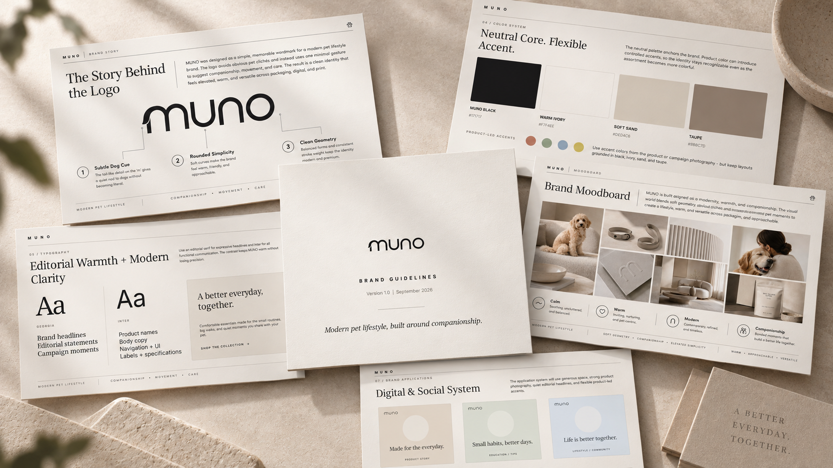
Selected proof shows how identity decisions move from logo development into color, typography, imagery, and practical applications.
A modern pet-lifestyle identity built around calm, warmth, contemporary restraint, and everyday companionship.
A design-led, pet-first system built to feel useful, warm, modern, and easy to live with.
A founder-led agency identity built to keep evidence, clarity, and the work itself more prominent than decorative branding.
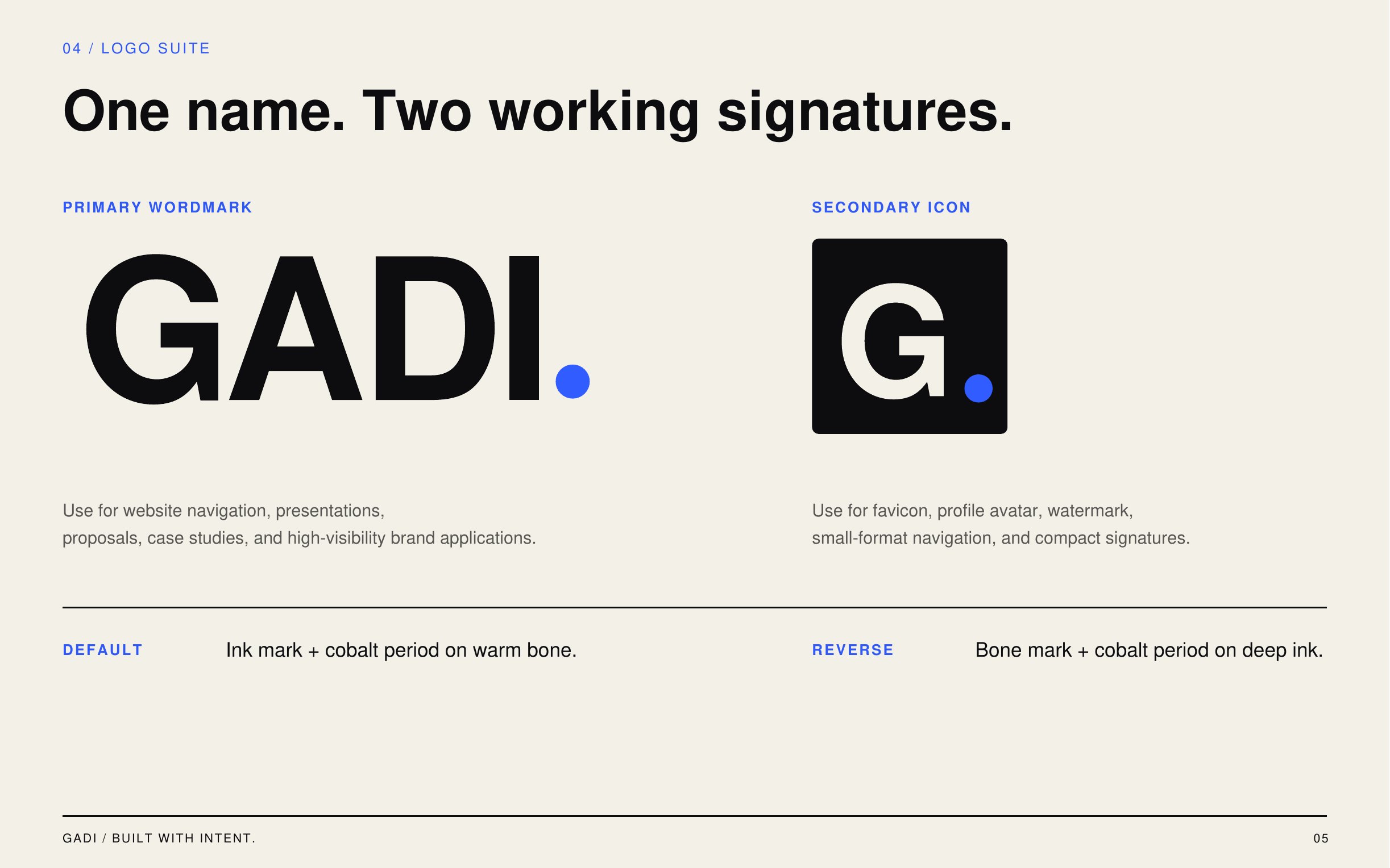
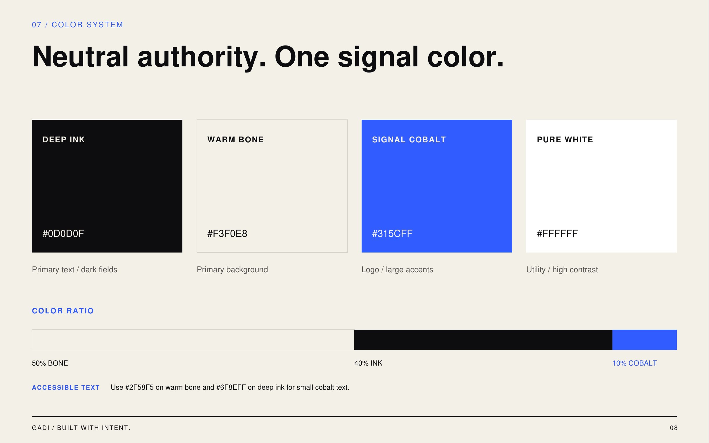
Exact scope is confirmed per project. These are the working areas the service is designed to cover, not an automatic promise that every item is included.
Brand role, audience context, message hierarchy, and the decisions that should guide the visual system.
Logo use, typography, color, art direction, layout behavior, and practical digital applications.
A usable reference for keeping future creative consistent without turning the brand into a rigid template.
Priority touchpoints such as website direction, campaign modules, and social examples when they are part of the approved scope.
Start with the current brand, what is no longer working, and where the business needs to go next. GADI can define the right identity scope from there.
Start a Project ↗